Newsletters – Shout it Out or Lose Your Voice
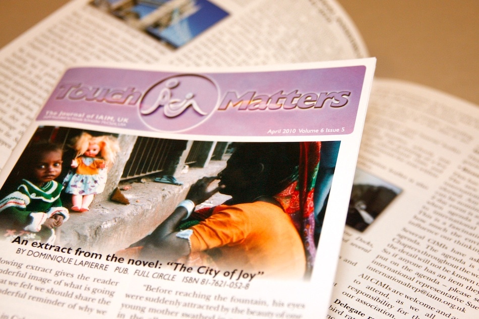
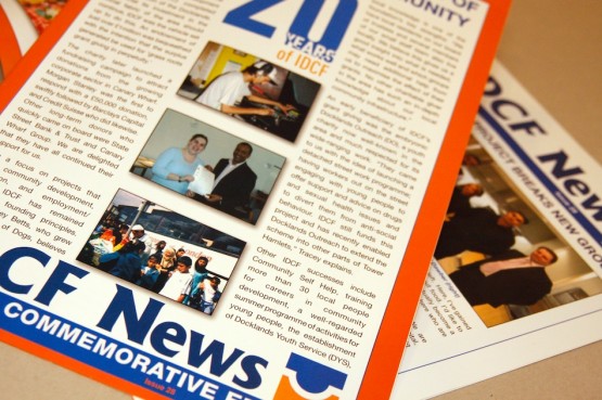
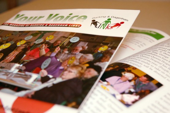
April – May / beginning of June means the end of Spring (well with our weather – who knows?) But anyway, with the end of spring, brings the newsletter season. Actually this time round, I had the opportunity on both newsletters and price lists, as some are shown in the pictures….
24 page A5 newsletter. Colour and Black & White, printed on 115gsm gloss.
12 page A4 special Edition Newsletter. (8 page with an additional 4 Special Cover). BOdy printed on 130gsm gloss cover printed on 200gsm gloss.
12 page A4 Newsletter. Colour throughout, printed on 150gsm gloss.
6 Panel A5 price lists. Colour throughout, printed on 150gsm silk.
I like newsletter work. Newsletters are excellent jigsaw puzzles to put together. As a rule, there is a set way of doing things that the content is manipulated to fit into. But there are those other occasions when I get to design (or redesign) the layout.
What’s nice about those times is that it stretches the mind to think about how the content will fit into the pages in the future. The use of page “furniture” like page number styles, frames and borders if any, and use of margins and columns really allows the newsletter to have a voice or tone about it…. Too playful and you can lose an audience, too serious and you can do the same. It’s a balance.
Each publication requires a different setup and mental attitude also – so a degree of flexibility/agility is needed to make it fit together well. Over the last several weeks, I’ve been fortunate to work on some simultaneously, which also means mental juggling. Work – proof – work – proof.
The main thing for me personally, is to make the newsletter pleasant to view but without losing legibility. After all, if the reader cannot understand the text, then there’s no point in having a story at all.
Every business, every person has a story to tell. Part of my job to make it as easy to understand and appropriate as possible. Fancy pictures cannot take the place of content unless the pictures have meaning of their own. This is the point of design, I think, to not just make things pretty – lots of people can do that – but to deliver the real meaning that needs to be put across.
Keep the essential message or lose your voice – good design helps to keep it.


