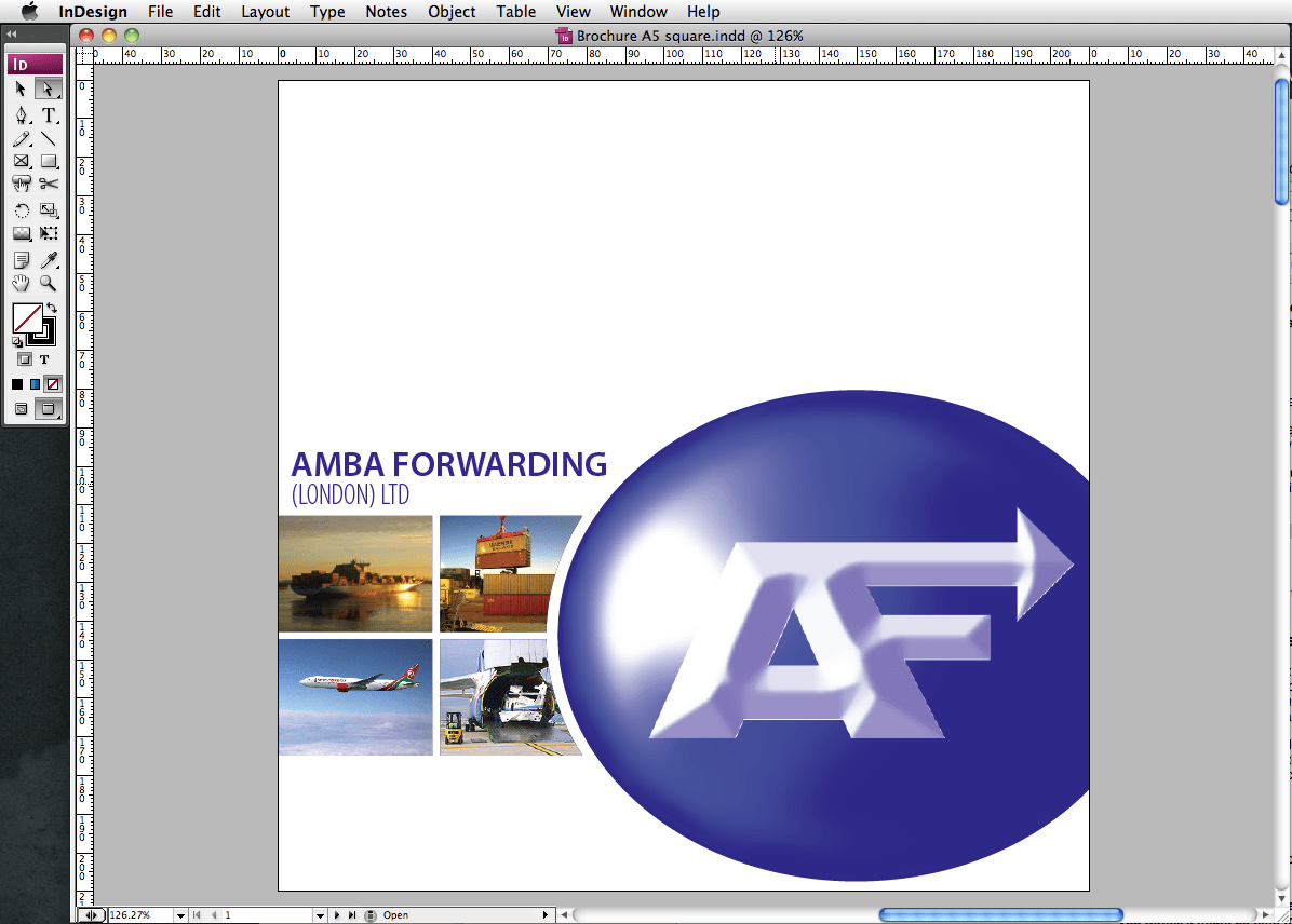
How to design better Artwork in 10 steps

This is a little guide to help design as best as you can for a free or very little money. The details work in any software because they are principles rather than software technique. So, let’s get started!
Planning
1: Get a pen (or pencil – I prefer pencil) and some blank, scrap paper.
2: Decide the message before going to the computer. Put everything you can think of onto the paper – then start stripping away everything that distracts from what you really want to say.
3: Get a new sheet of paper and start laying your material out roughly. Use boxes to indicate where the text should go – write the titles boldly where they should go. Put boxes for pictures with a rough indication of content.
4: Refine your layout.
Consistency
5: If your document has more than one page, you should design it as a whole, using elements that are common throughout – this will help your audience to feel at home when they read through.
Keeping it simple with software
6: Now that you have a layout guide on paper, and have kept it consistent, you can start using preparing your document on computer. Always, always start by making the document properties the same size as you intend to output. So for example, if you want to print an A5 booklet, design it in A5. This will eliminate problems and hassles later.
7: Don’t go wild with fonts and colours. A splash of colour here and there makes a more refined, classy document than one with colours everywhere. Stick to 3 or 4 typefaces maximum – including headings. By doing this, you can choose more dramatic fonts while keeping things tidy.
8: Spellcheck. At least twice.
9: Save regularly.
10: If printing at a printers, export as a high quality PDF to help produce predictable, consistent results.
Remember, ask for help if needed. Maybe you don’t know how to make the software do what you want… It might be time to explain your needs to a designer and they can help meet your requirements.
Good luck!
